- FeaturesLive Copy Paste
Cross Domain & Live Template Copy Addon for Site
Template Library2000+ ready blocks, header-footer, pages, & templates
Floating EffectsAdd awesome floating animation to any elements
Widget TooltipCustomize tooltip with images, gifs, & backgrounds
Equal HeightMake every widgets & content equal of heights
Visibility ControlsSelect content audience from roles and browsers
Wrapper LinkAdd dynamic links to any thing on your website
Background OverlayAdd background overlay color to widgets & sections
Confetti EffectsDisplay lots of party popper particles in any section
Duplicate OptionOne-click to duplicate whole page, post & template
Particles EffectsSnappy particle animations for your live website
Transform EffectsCustomize widget dimension beyond normal scale
IframeEmbed content, site, media within your website
Cursor EffectsCustomizable cursor button for professional web design
Grid LineDynamic grids for easy web design maneuvers
Dynamic Grid & CarouselFully custom grid and carousel for posts (single)
Remote ArrowsDiscrete navigation controls for carousel widgets
NotationHighlight text or heading with marker notations
Tile ScrollTurn section backgrounds into interactive galleries
Horizontal ScrollerDynamic horizontal scrolling slider widget in action
- Widgets
- 3rd Party Plugins 87
- Advanced 9
- Analytics / Progress 9
- Button / Link 11
- Card / Feature Box 17
- Carousel / Slider 30
- Counter/ Countdown 6
- Creative 5
- Extension 26
- Form / Newsletter 26
- Image / Gallery / Grid 30
- Menu / List / Table 20
- Others 35
- Post / Query 23
- Review 7
- Social Media 10
- Tabs / Accordion 12
- WooCommerce 12
360° Product ViewerPro Popular3D TextFree PopularAccordionFreeACF AccordionPro PopularACF GalleryProACF ListProACF SliderProACF TabsProAdBlock DetectorPro PopularAdvanced ButtonPro PopularAdvanced CalculatorPro PopularAdvanced CounterPro PopularAdvanced DividerProAdvanced Google MapPro PopularAdvanced HeadingPro PopularAdvanced Icon BoxPro PopularAdvanced Image GalleryPro PopularAdvanced Progress BarProAge GateFree PopularAir PollutionProAnimated CardProAnimated Gradient BGFreeAnimated HeadingProAnimated LinkFreeAudio PlayerProBackdrop FilterFreeBackground ExpandFree PopularBackground OverlayFreeBackground ParallaxProBarcodeProbbPressProbbPress Forum FormProbbPress Forum IndexProbbPress Reply FormProbbPress Single ForumProbbPress Single TagProbbPress StatsProbbPress Topic FormProbbPress Topic TagsProBrand CarouselProBrand GridFreeBreadcrumbsProBuddyPress FriendsProBuddyPress GroupProBuddyPress MemberProBusiness HoursFreeCaldera FormFreeCalendlyFreeCall OutFreeChangelogProCharitable CampaignsProCharitable Donation FormProCharitable DonationsProCharitable DonorsProCharitable LoginProCharitable ProfileProCharitable RegistrationProCharitable StatProChartsPro PopularCircle InfoPro PopularCircle MenuPro PopularCommentProComparison ListPro PopularConfetti EffectsPro PopularContact Form 7FreeContent ProtectorPro PopularContent SwitcherPro PopularCookie ConsentFreeCountdown TimerFreeCoupon CodeProCreative ButtonFreeCrypto Currency CardProCrypto Currency CarouselPro PopularCrypto Currency ChartPro PopularCrypto Currency Chart CarouselPro PopularCrypto Currency GridPro PopularCrypto Currency ListPro PopularCrypto Currency TableProCrypto Currency TickerPro PopularCursor EffectsPro PopularCustom CarouselProCustom GalleryFreeCustom JSFreeDark ModeFreeDevice SliderProDocument ViewerProDownload MonitorProDropbarFreeDual ButtonFreeDynamic CarouselPro PopularDynamic GridPro PopularEasy Digital DownloadProEDD CartProEDD Category CarouselProEDD Category GridProEDD CheckoutProEDD HistoryProEDD LoginProEDD Mini CartProEDD Portfolio EditorProEDD ProductProEDD Product CarouselProEDD Product ReviewsProEDD Product Reviews CarouselProEDD Profile EditorProEDD Purchase HistoryProEDD RegisterProEDD TabsProEqual HeightFree PopularEvent Calendar CountdownProEvents Calendar CarouselProEvents Calendar GridFreeEvents Calendar ListProEverest FormsFreeFacebook FeedFree PopularFacebook Feed CarouselPro PopularFancy CardProFancy IconFreeFancy ListFreeFancy SliderProFancy TabsProFAQ / Accordion / SpoilerProFeatured BoxFreeFlip / 3D / Animated BoxFreeFloating EffectsFree PopularFloating KnowledgebasePro PopularFluent FormsFreeFormidable FormsFreeForminator FormProGive Donation HistoryProGive Donor WallProGive FormProGive Form GridProGive GoalProGive LoginProGive Profile EditorProGive ReceiptProGive RegisterProGive TotalsProGoogle ReviewsPro PopularGravity FormsProGrid LineFree PopularHash LinkProHelp DeskProHoneycombsPro PopularHorizontal ScrollerPro PopularHover BoxPro PopularHover VideoPro PopularIcon Mobile MenuFree PopularIcon NavProIframePro PopularImage AccordionFreeImage CompareFreeImage ExpandProImage Hover EffectsPro PopularImage MagnifierFreeImage ParallaxProImage StackFreeInstagramProInstagram FeedProInteractive CardProInteractive TabsProLayer SliderProLearnPress CarouselProLearnPress GridProLightbox / Modal BoxFree PopularLogo CarouselProLogo GridFreeLottie Icon BoxProLottie ImageProMailchimpProMailchimp For WordPressProMarker/Image HotspotProMarqueePro PopularMega MenuPro PopularMemberFreeModalProNavbarFreeNews Ticker / Post TickerProNinja FormsFreeNotationPro PopularNotificationProOffcanvas / SidebarProOpen Street MapFreePanel SliderFreeParallax EffectsProParticlesPro PopularPortfolio CarouselPro PopularPortfolio Gallery / GridPro PopularPortfolio ListPro PopularPost / Blog CarouselProPost BlockProPost Block ModernProPost CardProPost GalleryProPost GridPro PopularPost Grid TabProPost ListProPost SliderProPrice ListFreePrice TableProProduct CarouselFree PopularProduct GridFree PopularProfile CardProProgress pieFreeProtected ContentProQR CodeProQuFormProReading ProgressFreeReading TimerFreeRealistic Image ShadowPro PopularRemote ArrowsPro PopularRemote FractionPro PopularRemote PaginationPro PopularRemote ThumbsPro PopularReveal EffectsProReview CardFreeReview Card CarouselFreeReview Card GridProRevolution SliderProRight Click Context MenuProRipple EffectsPro PopularScroll BoxProScroll ButtonFreeScroll Fill EffectPro PopularScroll ImageProScrollnavProSearchFreeSection StickyProSimple Contact FormFreeSingle PostProSliderFreeSlideshowProSlinky Vertical MenuProSocial ProofProSocial ShareProSound EffectsProSource CodeProStackerPro PopularStatic CarouselFreeStatic Grid TabFreeStep Flow / Process StepFreeSub MenuPro PopularSVG BlobPro PopularSVG ImageFreeSVG MapsPro PopularSwitcher / ToggleProTableProTable of ContentProTablePressProTabsPro PopularTags CloudProTestimonial CarouselProTestimonial GridFreeTestimonial SliderProThe NewsletterProThumb GalleryProTile ScrollPro PopularTimelineProTimezoneProToggleFreeTotal CountProTrailer BoxFreeTransform EffectsFree PopularTutor LMS Course CarouselFreeTutor LMS Course GridFreeTwitter CarouselProTwitter GridFreeTwitter SliderProUser LoginProUser RegisterFreeVariation SwatchesProNew PopularVertical MenuPro PopularVideo Gallery / PlaylistProVideo PlayerProVisibility ControlsPro PopularWeatherProWebhook FormProWeFormsFreeWidget TooltipFree PopularWooCommerce Add to CartProWooCommerce CarouselProWooCommerce Cart PageProWooCommerce CategoriesProWooCommerce Checkout PageProWooCommerce Mini CartProWooCommerce ProductsProWooCommerce SliderProWooCommerce Tracking FormProWP FormsProWrapper LinkFree PopularOps! Your Searched widget not found! Do you have any idea? If yes, Submit here - TemplatesReady Pages
Crafted page templates to help you get started with your landing page just by dropping a starter design
Ready BlocksReady Blocks comes with a variety of layouts and design elements, such as headers, footers, and widgets etc.
Ready HeaderPre-designed headers with lucrative styles that are suitable for various niche websites and design tastes
Ready FooterA helpful collection of footer designs to help you create an instant attractive footer on your landing page
- Pricing
- ResourcesGet Support
Find us 24/7 at your service. We are glad to help.
Knowledge BaseDetailed guidelines available for every features at BdThemes
BlogLearn something new, stay informed about WordPress, Web Design and more
ChangelogHere are some of the key milestones in my development:
Video TutorialLearn product usage, WordPress tips & tricks from our videos
Affiliate SignupEarn hefty commissions by joining us in the promotion
Share Widget IdeaWidget Idea Share is a great way to find similar widgets that you can improve.
Contact UsCertainly! If you need to get in touch with us feel free to reach out
- ProductsZolo Blocks New
The zoloblocks plugin which lets you create stunning websites using the gutenberg site builder
Prime Slider hotMost superior Slider in the Era of Elementor Slider
Ultimate Post KitThe only Compatible blogging widgets in Elementor for any Blog
Ultimate Store KitCreate next gen e-commerce website for your business in WordPress
Pixel Gallery NewOrganize your photos in a different angel every time with Elementor
Spin Wheel NewBoost your website engagement and drive more sales with Spin Wheel WordPress plugin.
AI Image Generator NewThe AI Image Generator Plugin for WordPress is a powerful tool by ChatGPT
AR ViewerGet 360° Augmented Reality for WooCommerce today!
Live Copy PasteCopy & Paste any web design you like just with 2 clicks!
RootenA fully functioning theme for elementor with unlimited options
TestimonialShowcase customer feedback and reviews to build trust and credibility.
Graphics Item PopularGet amazing Flyers, visiting card, Logo template from here
Explore package advantages

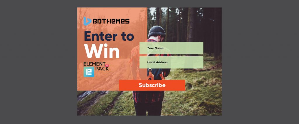 The background image of your Exit intent Popup should be engaging. Put something that makes sense, goes with the theme of your website, and appealing.
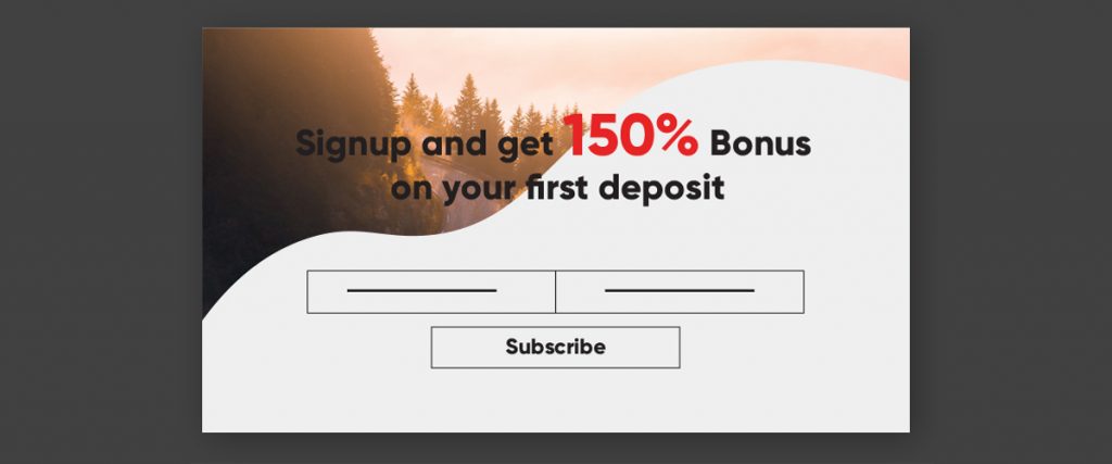 Another very important part is the headline. You should be able to hook up your visitor the moment they read the headline. Show them what they are getting here and that’s it!
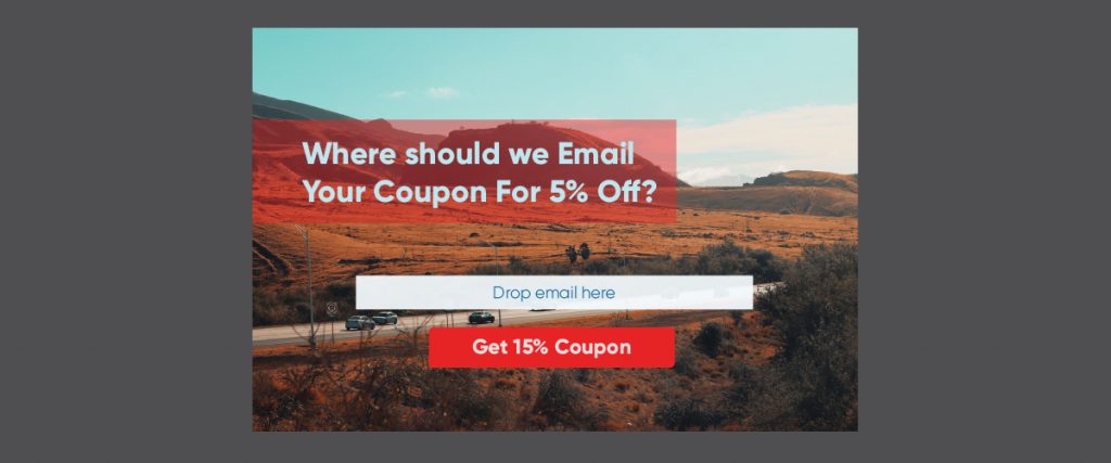 The CTA prompt is an important part of your Exit Intent Popup. The flashy big red button in the middle or at the top-bottom of the popup makes anyone want to click it. Well, the CTA is designed to redirect the users to the subscription page upon when they click it. Try to be direct. Let your visitor know what they need to do.
 You have a beautiful and appealing popup, yet you haven’t made any progress? In that case, the solution is in the offer you are making. Your offer should cope with your target consumers. Needless to say, take a note on these two points:
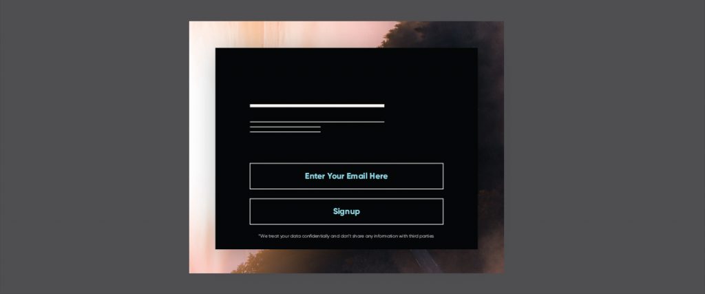 In our new age of online markets, privacy is a very sensitive issue. People often face many online scams and hacker attacks by exposing their personal information like bank account or so. To make things suitable for the visitors having privacy concerns, you can actually apply a wonder solution:
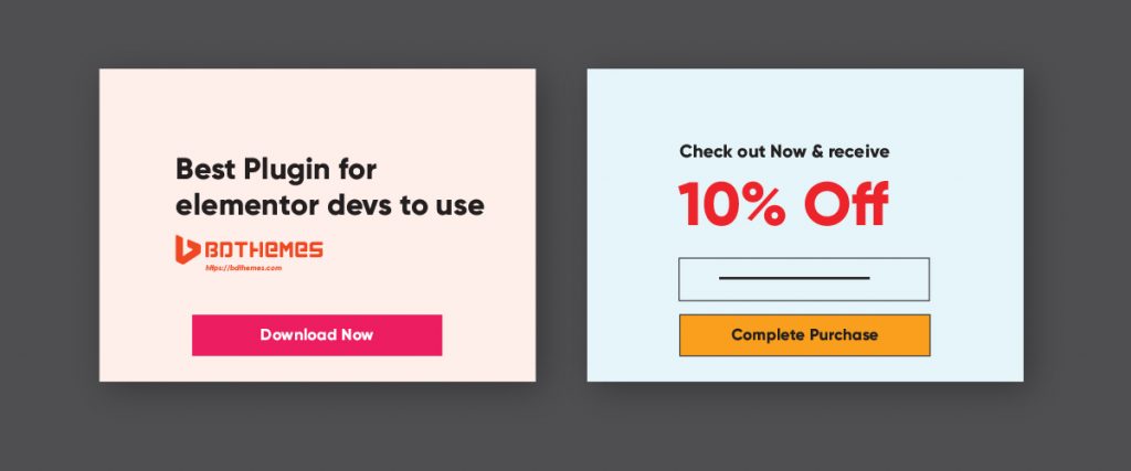 Remember these key points:
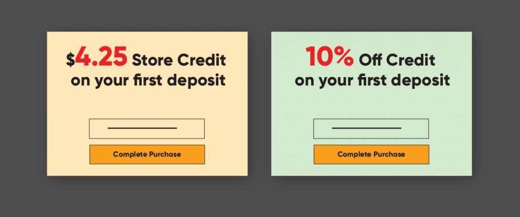 Finally, you should not finalize your Exit Intent popup in one go. Creating something takes time and brainstorming. Often there is a possibility that having a second look filters out the odds. Before choosing the final campaign make sure to check it in a different look.